
Mister Car Wash
Rethinking the kiosk
Role
Creative Director / Designer
Team
Hydrant
It’s time to turn “I just want the cheapest one” into “Let’s go for it!” That's the challenge we set out to tackle with Mister Car Wash and their humble kiosk. We put on our thinking caps, went out and experienced a car wash or two, talked to numerous people, interviewed managers, charted observations, and surveyed what worked and needed improvement. Armed with those insights, we envisioned what the customer experience at the kiosk could be...what it should be. Our digital design was steeped in real-world, first-hand, experiential knowledge that would excite the customer with the same care they have come to expect when they visit their local Mister Car Wash.
BRAND STRATEGY, DIGITAL DESIGN, EXPERIENCE DESIGN
Our design approach was led by the customer, to guide our decision making process. The surrounding environment of the kiosk played a considerable role in the customer's mindset, and them feeling confident in the process of selecting the desired level of car wash service.

Seasonal screen based on region
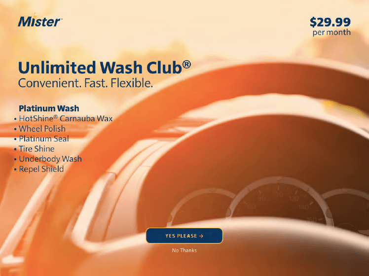
Imagery from customer point of view
With our research in place, we set out to improve the kiosk experience, creating a stronger, more considered connection with the customer.
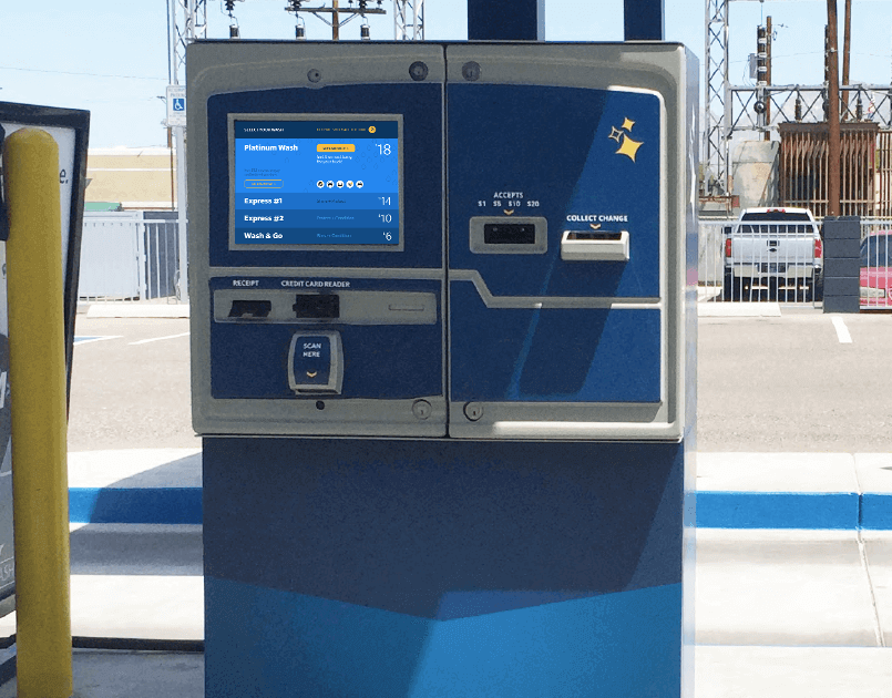
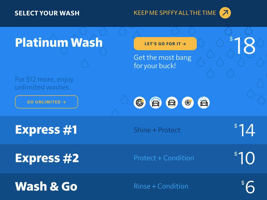
The final menu screen was set in a card-style menu that gives the customer an at-a-glance overview of all services in a more engaging manner, empowering the customer to make informed decisions.
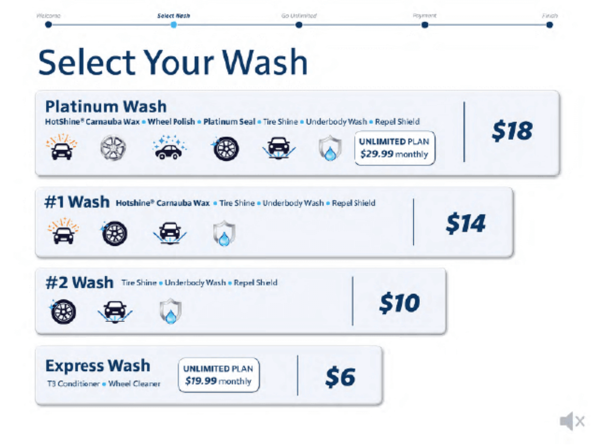
Current kiosk menu
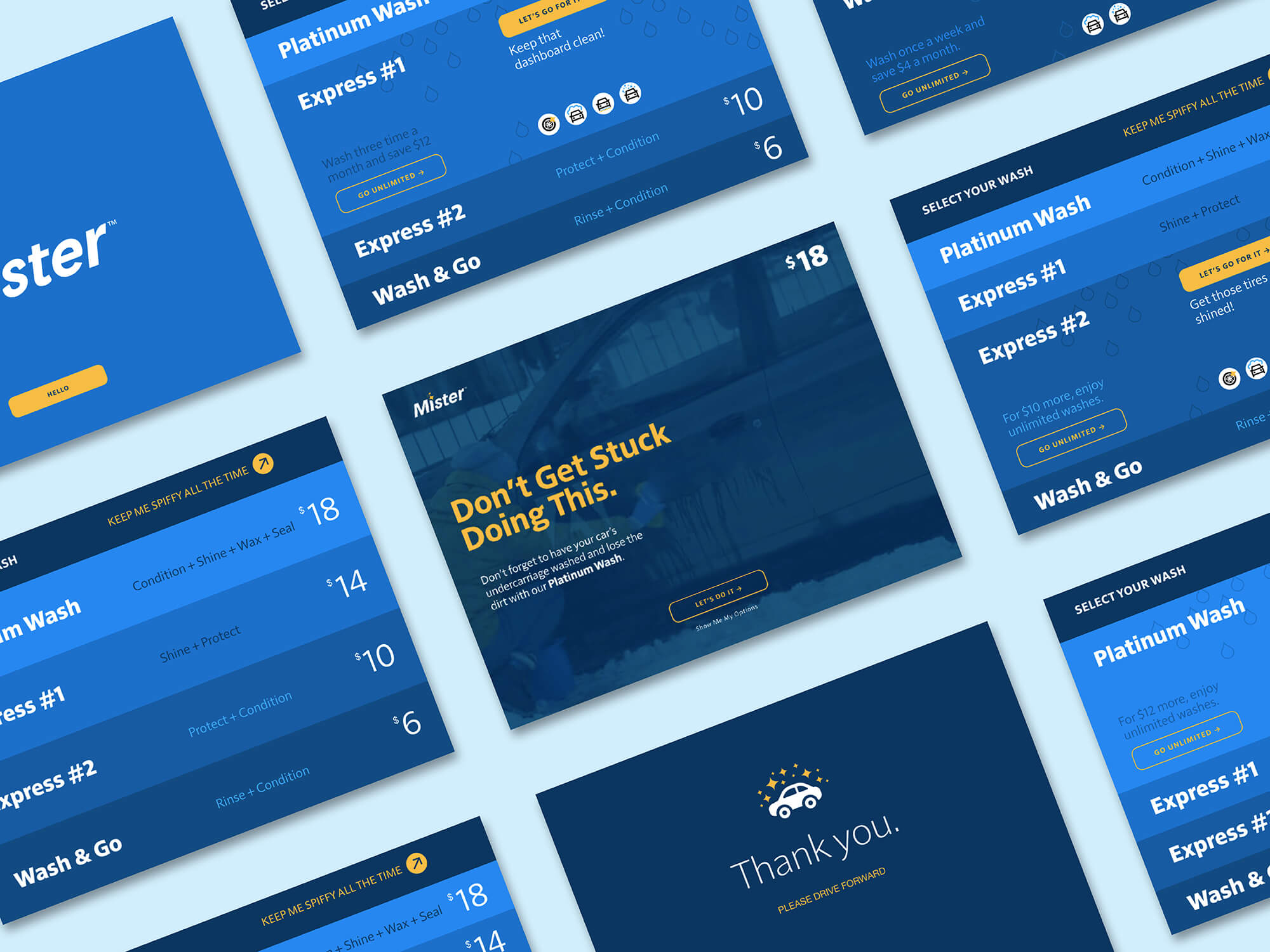
Screenflow overview
© 2014 — 2026 Stephen T. Yeakley

